
Designing Brochures That Speak Louder Than Words
 By Tooba Wajid
- Marketing
- 3 minutes read
- 153 Views
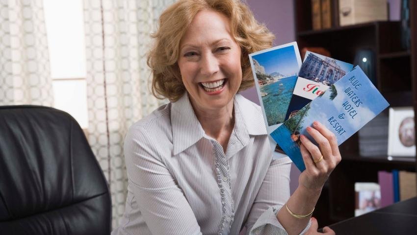
A well-designed brochure can do more than inform—it can inspire action. Designing Brochures That Speak Louder Than Words shows you how to combine layout, visuals, and messaging to create print materials that truly connect. Ideal for marketers, designers, and businesses aiming to leave a lasting impression.
Designing Brochures That Speak Louder Than Words
In a world flooded with digital noise, sometimes the most powerful message is one you can actually hold in your hands. A well-designed brochure doesn’t just share information—it tells a story, sparks emotion, and moves people to action. Brochures really do speak louder than words when they are properly designed.
So how can you design a brochure that not only looks good but grabs attention and delivers results?
Let’s break it down.
1. Know Your Audience First
Before you even choose colors or fonts, ask yourself:
Who is this brochure for?
What problem are they facing?
What do I want them to do?
Understanding your audience’s mindset helps shape both the content and design in a way that feels personal and persuasive.
2. Visuals Are the Real Voice
Images and layout are what people notice first. A strong visual hierarchy guides readers smoothly through your message.
Tips:
Make use of top-notch photos that complement the tone of your brand.
Apply bold headings and clean spacing.
Keep paragraphs short and punchy.
Remember: If your visuals don’t stop the reader, your words won’t even get a chance.
3. Simplicity is Powerful
A cluttered brochure is a silent brochure—no one reads it.
Use minimalist design and focused content. Stick to the essentials. One clear message per section is more effective than cramming it all in.
Pro Tip: Use bullet points and infographics to communicate complex ideas at a glance.
4. Make It On-Brand
Every element—colors, typography, tone—should reflect your brand’s identity.
Are you:
Professional and polished? Use clean lines, muted tones, formal fonts.
Fun and energetic? Go with vibrant colors, creative layouts, playful language.
Consistency makes your brochure not only recognizable but trustworthy.
5. Write Like You Talk
Ditch the jargon. Write copy that sounds human, not robotic.
Instead of:
"Our company provides industry-leading solutions in digital transformation."
Try:
"We help businesses grow fast with smart digital tools."
People connect with clarity, not complexity.
6. Add a Clear Call-to-Action (CTA)
What do you want the reader to do next?
Whether it’s:
Visiting your website
Calling your office
Scanning a QR code
Or booking a free consultation
Make your CTA visible, strong, and urgent. Don't make them guess what to do next.
7. Choose the Right Format
Not all brochures are the same. Consider:
Tri-fold: Best for step-by-step info.
Z-fold: Great for storytelling or timelines.
Booklet: Ideal for detailed product/service info.
Match your format with your message.
Conclusion: Let Your Brochure Do the Talking
In the end, a powerful brochure blends smart design, thoughtful content, and brand personality into a compact, compelling piece of communication. It becomes more than just paper—it becomes a voice for your brand.
So next time you design a brochure, make it one that speaks louder than words.
Tooba Wajid
Leave a comment
Your email address will not be published. Required fields are marked *
