
Interaction Design: The Tiny Details That Make or Break Everything
 By Rukhsar Jutt
- Designing
- 5 minutes read
- 135 Views
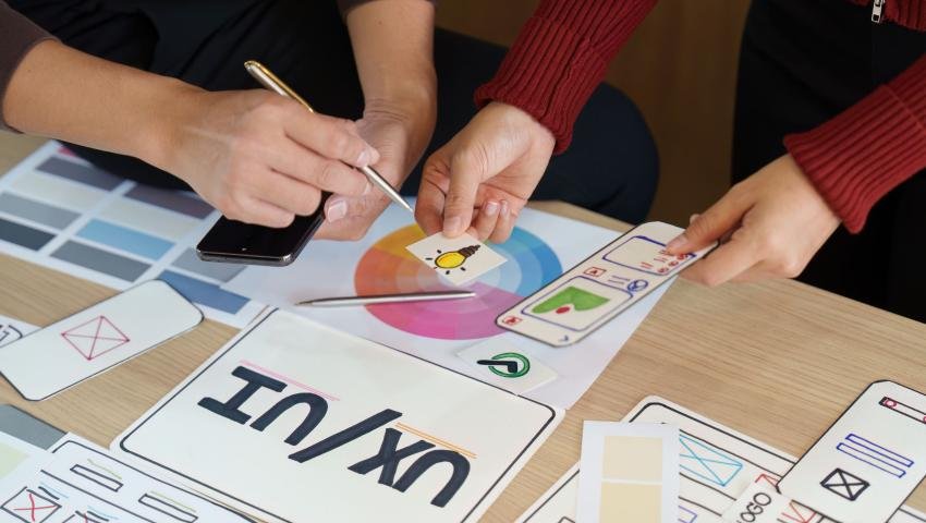
Interaction design (IxD) is all about how users interact with a digital product — the buttons they click, the gestures they use, the feedback they get, and the flow they follow. It’s the invisible layer that makes a website, app, or device feel intuitive, smooth, and even enjoyable to use.
Interaction Design: The Tiny Details That Make or Break Everything
Let’s be real: most people don’t even know what interaction design is.
But you know when it’s missing.
You tap a button, and nothing happens — no feedback, no movement, no clue if it worked.
You fill out a form, hit “submit,” and the page just... stares at you.
You try to close a modal, and the X button is like 4 pixels wide, hiding in the shadows like it owes you money.
That’s what bad interaction design feels like: awkward, unresponsive, frustrating.
And when it’s done right?
You barely notice it.
Because everything just works.
So, What the Heck Is Interaction Design?
In plain English:
It’s how your product feels when someone actually uses it — not just how it looks, but how it lives and breathes in their hands.
Not what it looks like.
What it does when people touch it, tap it, click it, swipe it, scroll it, or try to make it dance.
It’s the cause-and-effect layer — the feedback loop that tells users:
“Yep, you did the thing. I got it. Now here’s what’s next.”
It’s the difference between pressing a button and feeling nothing…
vs. pressing a button and getting a satisfying click, a loading spinner, and a message that says “Success! You’re in.”
Why It Gets Overlooked
Because it’s invisible when it works.
Designers obsess over the visual stuff — color palettes, typography, spacing (guilty).
Developers are thinking functionality — does it save, update, process, fetch?
Interaction design lives in the space between.
And since no one owns it fully, it gets skipped or slapped together at the last minute.
But trust me — users notice. They might not be able to explain why it feels good — but they know when it does.
Clunky transitions? Confusing hover states? Buttons that don’t respond? They bounce.
Good Interaction Design Feels Like This
- You hover over a button, and it gently lifts — like it’s inviting you to click.Feels alive.
- You click “send” and the button pulses, then turns into a checkmark. You exhale.
- You swipe left and a card smoothly disappears. Satisfying.
- You start typing and the app knows what you’re doing — autocomplete, tooltips, instant feedback. Magic.
These are small things, sure. But they’re the difference between “meh” and “wow, this is smooth.”
Common Interaction Design Crimes
Let’s call them out, because you’ve definitely seen (or committed) some of these:
- Buttons with no hover state – Am I supposed to click this? Or is it just text in a box?
- Forms that don’t tell you what went wrong – “Invalid input.” Okay but… why?
- No feedback on actions – Did it work? Did it crash? Am I still here?
- Surprise animations that take forever – If I’m waiting more than a second for a tooltip to appear, I’m out.
- Overused microinteractions – Yes, your button spins. Cool. Can we move on?
The point is: if the user has to guess what just happened, Or is it just… text slapped in a box, hoping for the best?
Interaction Design Is About Empathy
This isn’t just about flashy effects or “delight.” It’s about being a good communicator.
- “Hey, I heard you click this.”
- “That’s saving now, hang tight.”
- “You can go back any time.”
- “Here’s a preview of what’ll happen if you press this.”
It’s digital manners. It’s about giving people confidence.
If your product feels cold, confusing, or disjointed — they won’t stick around.
How to Nail It (Without Going Overboard)
1. Design for Feedback
Always answer: what happens next?
Loading states, error messages, confirmations — they’re not “extras.” They’re essential.
2. Motion with Purpose
Animations should make things clearer, not slower.
Use them to show hierarchy, flow, or completion — not just because “it looks cool.”
3. Predict Behavior
Anticipate what users are trying to do and make it easy.
Want to delete something? Show a quick “undo” option. Don’t make them dig through settings to restore it.
4. Test It With Humans
You know what makes sense to you — but you're not the user.
Put it in someone’s hands. Watch them try to use it. Every pause, every tiny hesitation — that’s your design waving a little red flag.
Interaction Design Isn’t Fluff — It’s the Glue
It’s what makes your product feel alive.
It’s what makes people trust your app.
It’s what turns “I tried it once” into “I use it every day.”
You can have the best backend in the world, a gorgeous UI, and killer features. But if the interactions feel broken, it’s like driving a Ferrari with no gas pedal.
People don’t want to fight your interface.
They want to feel like it’s reading their mind. That’s the magic of great interaction design.
Final Thought
If design is how it looks, and development is how it works — then interaction design is how it feels in your hands. Like intuition made tangible
Don’t leave it to chance.
Design it. Test it. Care about it.
Because no one ever said, “Wow, this app is confusing and unresponsive — I love it.”
Rukhsar Jutt
Leave a comment
Your email address will not be published. Required fields are marked *
