One Page. One Purpose. Infinite Conversions.
 By Tooba Wajid
- Designing
- 3 minutes read
- 131 Views
Simplicity sells. One Page. One Purpose. Infinite Conversions. reveals the power of a well-crafted landing page that drives action without distraction. Learn how to design high-impact, goal-focused pages that capture attention, deliver value, and convert visitors into customers—fast.
One Page. One Purpose. Infinite Conversions.
In a world overflowing with distractions, simplicity sells. And nowhere is this more powerful than on your landing page. The best landing pages don’t try to do everything—they do one thing exceptionally well.
Let’s break down why less is more, and how focusing your landing page on a single, crystal-clear purpose can unlock infinite conversion potential.
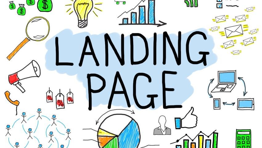
What Is a Landing Page (Really)?
A landing page is not your homepage. It’s a focused, standalone web page created for one goal:
Get the visitor to take action.
That could mean:
Signing up for a newsletter
Downloading an eBook
Registering for a webinar
Making a purchase
Starting a free trial
Whatever the goal, everything on that page—from the headline to the call-to-action (CTA)—should support it.
The Problem with “Do It All” Pages
A common mistake made by businesses is to stuff a landing page with too much information:
Multiple CTAs. Links to social media. Product catalogs. Navigation menus.
The result? Analysis paralysis.
Visitors get overwhelmed, confused, or distracted—and they bounce.
Your page shouldn’t be a buffet. It should be a guided experience that leads your audience straight to the action.
The One-Page Formula for Success
Here’s what a high-converting landing page includes:
1. A Killer Headline
Grab attention fast. Speak directly to the problem your audience faces and the benefit you offer.
Example: “Double Your Email List in 30 Days—Without Spending a Dime.”
2. A Clear, Relevant Offer
What’s in it for them? Keep it specific and solution-focused.
“Download our free 12-page guide to growing your traffic with zero ad spend.”
3. Social Proof
Use testimonials, ratings, case studies, or logos of trusted brands you’ve worked with to build trust.
4. Minimal Design, Maximum Focus
No navigation bars. No sidebars. No distractions. Your design should keep the visitor laser-focused on one thing: the CTA.
5. A Strong Call-to-Action
Don’t say “Submit.” Be bold.
Say things like:
“Get My Free Guide”
“Start My Free Trial”
“Book My Demo Now”
Why This Works (Psychology-Backed)
Cognitive Ease: A simple page reduces mental effort. People are more likely to act if it is simple to understand.
Decision Anchoring: One offer removes doubt or delay.
Urgency and Clarity: A single CTA on a targeted page conveys a sense of urgency and time sensitivity.
Real Results from One-Goal Pages
Brands that simplify often see higher conversion rates. For example:
Unbounce reports that landing pages with one clear CTA outperform those with multiple CTAs by up to 266%.
Neil Patel has shown that removing the main navigation bar can increase conversions by 28% or more.
Final Thoughts
Your landing page is your digital elevator pitch. You have seconds to hook your visitor and get them to take action.
So, remember:
One page. One purpose. Infinite conversions.
Focus your message. Design with intent. Deliver value fast.
And watch your conversions take off.
Tooba Wajid
Leave a comment
Your email address will not be published. Required fields are marked *
